How to Design an Engagement Ring Around a Sunset-Colored Gemstone
A peach sapphire looks nothing like itself in a jeweler's window at dusk and in a parking lot at noon. That is the first thing to accept before designing a ring around one. Sunset-colored sapphires — peach, salmon, warm pink, the orange-leaning pinks sometimes sold as padparadscha — shift with the light, and a design that ignores this will look washed out or overheated for most of the day. The fix is structural rather than mysterious: metal, halo and proportions, all of it plannable on paper before a single prong is bent.
Start With the Stone, Not the Setting
Most custom rings go wrong because the setting is chosen first and the stone is made to fit it. Reverse that. Sapphires vary enormously in hue, saturation, tone, cut quality and visible color zoning, and each variation wants a slightly different frame. A pale, silky peach oval needs help holding its own; a saturated orange cushion can carry a much heavier design without disappearing.
Source the center stone first, then design around its real dimensions in millimeters rather than its carat weight. Two 9 x 7 mm ovals from different cutters can read as different sizes once set, because depth and spread differ. Ask for the measurements and a photo of the stone face-up beside a ruler.
On durability and disclosure: sapphire is corundum, a 9 on the Mohs scale, which suits daily wear well — though a sharp girdle or pointed corner can still chip. Heating is standard, permanent and accepted in the trade; unheated stones are rarer and priced accordingly, while diffusion and fracture filling are different processes that should be disclosed. For a significant stone, ask for a report from a recognized gemological laboratory.
Read the Color in Real Light
See the stone in at least three conditions before committing: indirect daylight, warm indoor incandescent, cool white office light. Photos taken under a jeweler's lamp are useful for detail and misleading for color. Ask for a short daylight video outdoors with the stone moving — that shows both the true hue and whether color is evenly spread or concentrated in a streak.
This is also where you decide what the ring is for. A stone you love against your own skin in daylight is the right stone. If you are drawn to a very pale peach, plan for contrast elsewhere in the design; if you want a deep orange, you can afford to keep the setting quiet.
Pair the Metal With the Stone, Not the Trend
- White gold or platinum: cools the composition and pushes peach and salmon forward. Pale stones read more saturated against white metal because less warmth competes with them.
- Yellow gold: amplifies the orange in the stone. Excellent with a saturated orange or deep pink; risky with a faint peach that can start to look like diluted yellow.
- Rose gold: the most sensitive choice. It harmonizes with pink stones and can make them feel soft and blended, but with peach it can blur the boundary between stone and metal unless white prongs or a white halo create separation.
Mixed metals solve most of this. White prongs on a yellow gold band keep the stone bright while the band stays warm against the finger — one of the least expensive ways to get a more considered result.
Use the Halo for Contrast, Not Volume
A halo is a design tool, not a size upgrade. Around a sunset-colored center, its job is to control the transition between stone and metal. A single row of small round diamonds set close and angled slightly inward brightens a peach sapphire and gives it a crisp edge. A double halo adds formality and visual weight — good on a larger center, often too much on anything under roughly 7 mm across. Fancy shapes want a halo that follows the outline: oval center, oval halo; cushion center, cushion halo.
Three variations worth considering
White diamonds. The default, and usually the right one, because they create maximum contrast against a warm stone.
Champagne or peach accent stones. Warmer and more tonal. Striking on deep orange sapphires, but contrast drops, so the center needs enough saturation to hold the eye.
A plain gold bezel instead of diamonds. Cleaner and more modern, and it protects the girdle — worth having on a ring worn every day. A yellow gold bezel around an orange sapphire makes the stone look lit from behind; a white bezel around a pink one reads almost architectural.
Keep millgrain in mind too. Fine milgrain on a halo edge adds vintage texture, but on a small halo it can blur the outline. Detail needs room.
Get the Band Proportions Right
The band is where most designs lose their balance. As a reference point: 1.8 to 2.0 mm suits a center stone up to about 7 mm; 2.2 to 2.5 mm holds an 8 to 9 mm stone; larger stones can carry 2.5 to 3 mm without looking heavy. These are not rules, but they help when a CAD drawing is hard to judge on a screen.
Consider taper. A band that narrows slightly at the top pulls the eye upward and makes the center feel larger without adding metal. Check the head height as well: a low setting is easier to wear and catches less on clothing, while a high cathedral lifts the stone into the light and photographs better — but only if you actually like a ring that sits proud on the hand.
Plan the wedding band before you approve the engagement ring. A straight band sits flush only against a straight shank. If the ring has a low basket or a wide shoulder, you will need a curved or open band, and shaping the engagement ring to allow for that now is far easier than solving it later.
The Order of Decisions
- Set the total budget and split it roughly between stone and setting.
- Source and approve the center stone in daylight.
- Choose the metal family, then decide whether prongs or bezel will contrast with it.
- Decide halo or no halo, and how many rows.
- Fix band width, taper and head height against the stone's millimeter measurements.
- Plan the wedding band pairing.
- Approve the CAD render, then the wax or resin model in person if you can.
Steps four and five are the ones people rush. Have the render printed at actual size and hold it against your hand — a design that looks refined on a monitor can look chunky at 1:1, and a stone that seemed generous on screen can look modest once framed.
Final Details Before You Sign Off
Ask how the prongs will be finished; rounded, polished tips protect both the stone and your sweaters. Confirm the gallery is open enough to clean behind the stone, because a peach sapphire that collects soap and dust loses exactly the brightness you chose it for. Request a written appraisal for insurance, and follow the jeweler's care advice — warm water, mild soap and a soft brush are usually enough, but delicate pavé or a treated stone may call for something more specific. Sapphire is durable, not indestructible, so have the prongs checked once a year.
A sunset-colored stone rewards restraint. Get the light, the metal and the proportions right, and the ring will look deliberate in every room you walk into.
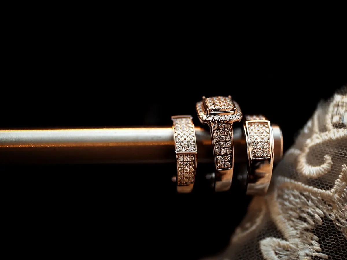
Photo: VGIO Studios / Pexels